The Great Twine Round-Up
The Great Twine Round-Up is an annual program by Cleanfarms that encourages farmers to drop off used baler twine at designated collection sites for recycling. For this project, I took the lead on design under the creative direction of Matthew Manuge, developing the branding for the campaign.
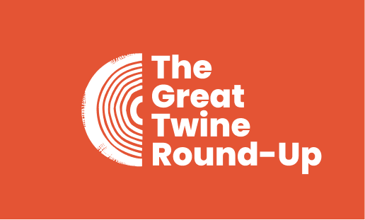
We drew inspiration from round haystacks and twine. The swirl of the haystack influenced the icon in the logo, resembling the side profile of rolled-up twine. The idea of stacking hay inspired the vertical arrangement of the text in the logo, creating a visual connection to the stacked hay concept. This approach led to a logo that naturally communicated the contest’s focus on recycling used twine, a key material in hay farming.
Contest Rules
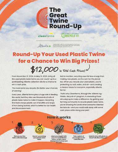
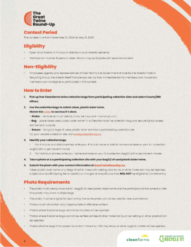
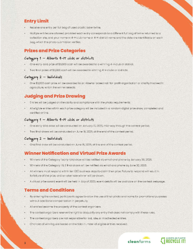
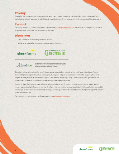
Once we had settled on a logo, we moved forward by developing a range of assets to solidify the brand's identity. This included defining key elements such as fonts, colors, accents, and icon styles that would give the brand a cohesive look across various touchpoints. One of our first deliverables was a 'Contest Rules' PDF, which involved carefully selecting typography and accent colors that aligned with the brand’s visual language. This ensured the document was not only functional but also consistent with the overall branding, setting the tone for all future materials.
Print Spreads
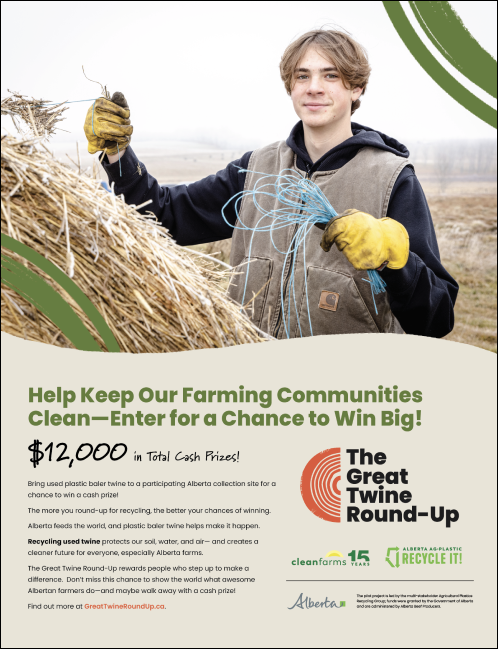
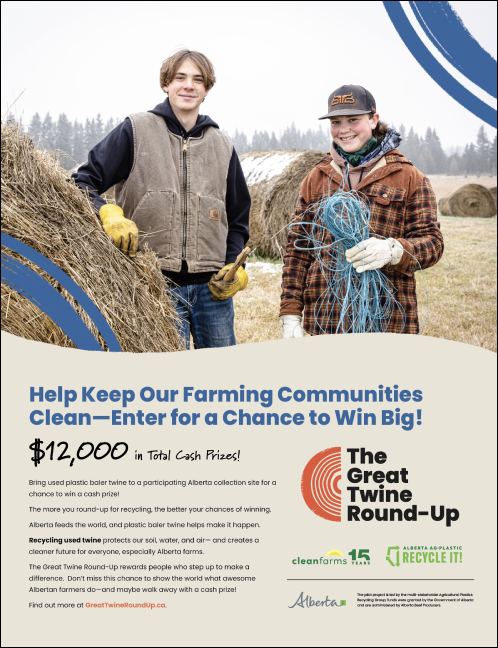
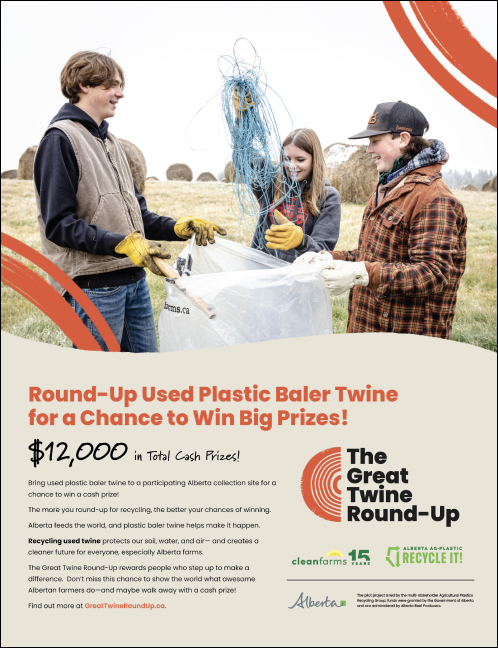
We were tasked with expanding the brand into print, so we showcased accents pulled from the logo to reinforce the connection between the design, twine, and round haystacks bound with twine. This was also a great opportunity to highlight client photos, showing how engaged and excited the youth were to participate in the Round-Up. The result was a print campaign that not only communicated the brand’s identity but also brought the contest to life through relatable, impactful imagery.
Website
We designed the website to focus on how the contest works, using the front cover of the 'Contest Rules' PDF as the homepage. The rules were placed on a separate page, while relatable photos were added to show what participating in the contest could look like. This approach helped clearly communicate the contest details and process while engaging users with visual elements.
Digital Ads
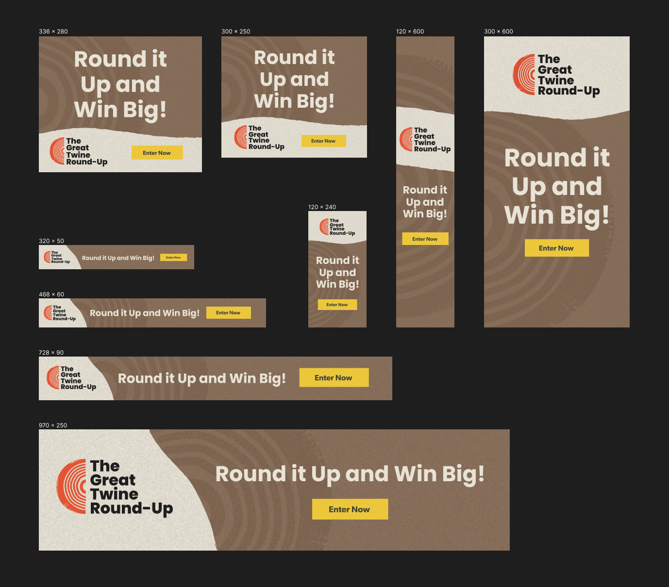
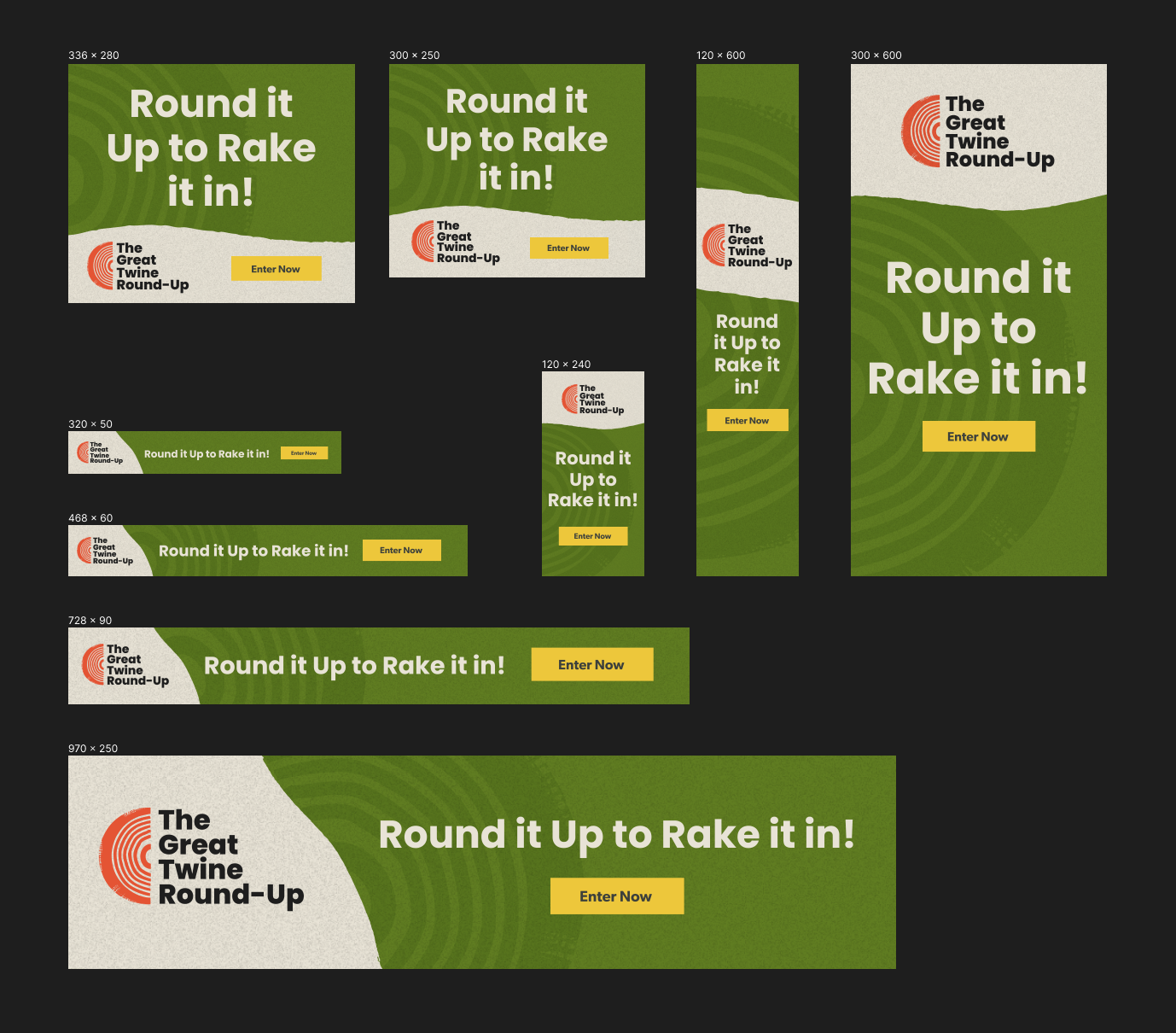
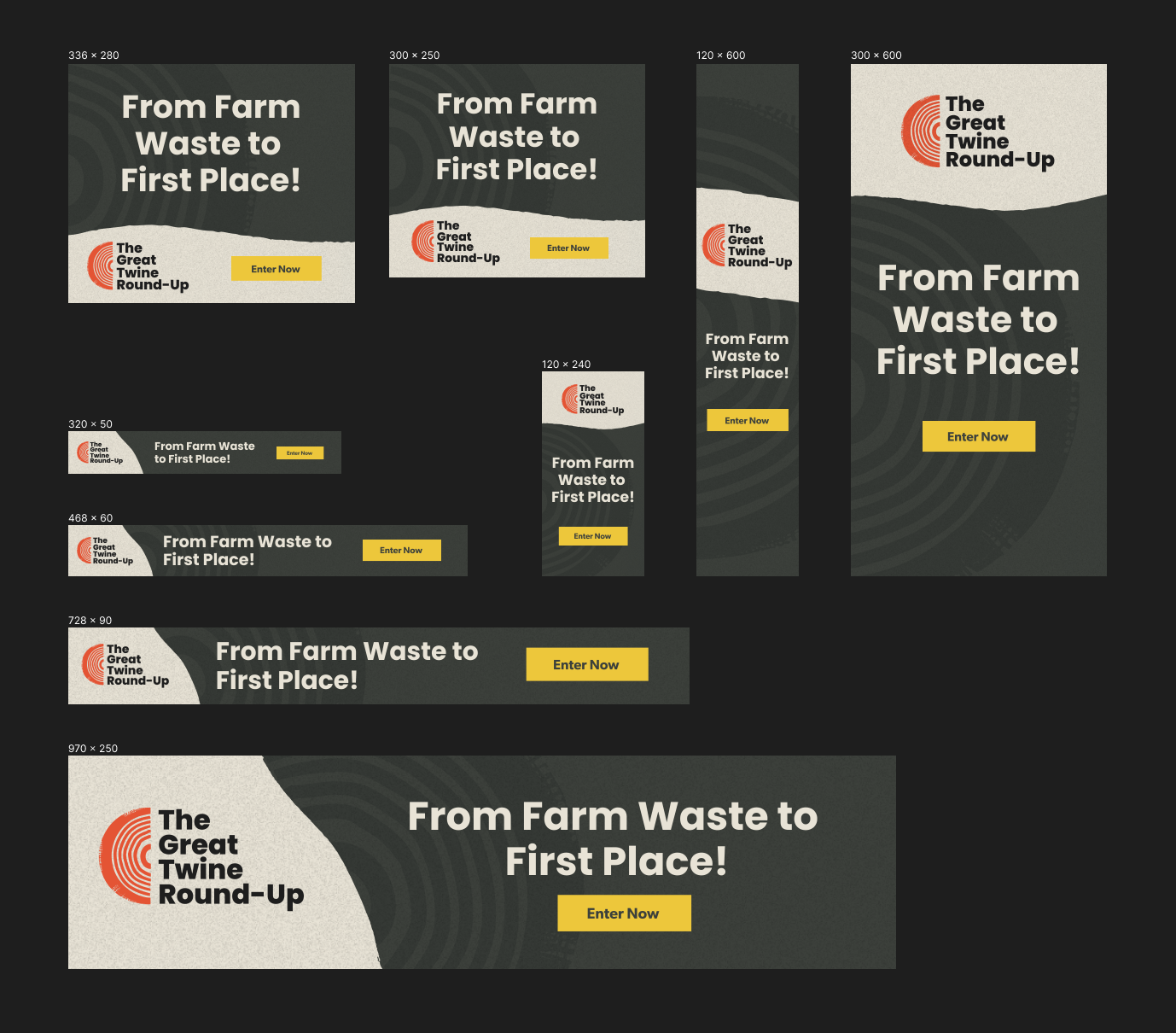
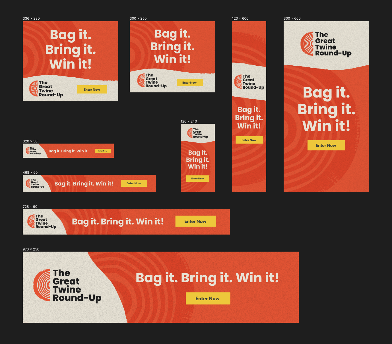
To spread the word, we created a series of digital ads. The challenge was designing dynamic visuals that could adapt to various sizes while still adhering to the brand guidelines. We developed four versions of the ads, focusing on playful copy, brand colors, and subtle logo accents, with a clear emphasis on the 'Enter Now' CTA button. The taglines added a playful tone, and the varied backgrounds helped keep the ads visually fresh and engaging with each viewing.
Social Media
Our next challenge was to expand the brand to social media. We designed a motion graphic ad in both 9:16 and 1:1 formats, making it adaptable for stories, reels, and posts. By incorporating a variety of colors, photos, and taglines, and adding motion, we maintained consistency while keeping the marketing fresh and engaging.
